*해결: 축 속성의 배율 구분선(scale breaks)을 활용
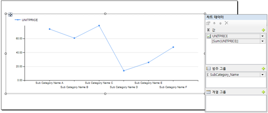
*Step1. 원하는 모양의 차트 생성
1. SP
SELECT
     DATEPART(YEAR,[ORDERDATE]) AS  Year
     , DATEPART(MONTH,[ORDERDATE]) AS  Month
     , pc.Name as  Category_Name
     , psc.Name as  SubCategory_Name
     , SUM(B.UNITPRICE) AS  UNITPRICE
FROM  [SALES].[SALESORDERHEADER] AS A with(nolock)
JOIN [SALES].[SALESORDERDETAIL] AS B  with(nolock)
     ON A.SALESORDERID =  B.SALESORDERID
JOIN  [Production].[Product] as pd with(nolock)
     ON  B.ProductID = PD.ProductID
join  [Production].[ProductSubcategory] as psc with(nolock)
     on  pd.ProductSubcategoryID = psc.ProductSubcategoryID
join [Production].[ProductCategory] as pc  with(nolock)
     on psc.ProductCategoryID =  pc.ProductCategoryID
GROUP BY  DATEPART(YEAR,[ORDERDATE])
     ,  DATEPART(MONTH,[ORDERDATE])
     ,psc.Name
     ,pc.Name
2. 차트 생성
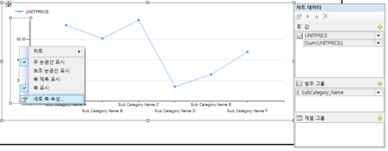
*Step2. 속성 수정
1. Y축 마우스 우클릭 > 세로 축 속성 선택
2. 축 옵션 탭 > 배율 구분선 사용 체크
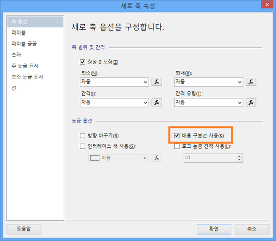
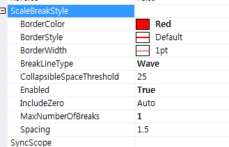
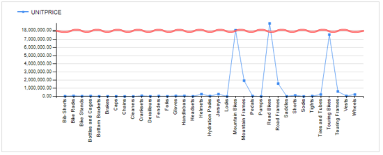
3. 세로축의 속성창 ( F4 )에서 스타일 수정
a. BorderColor: Red
b. BreakLineTpe: Wave
c. CollapsibleSpaceThreshold: 10 ~ 25 사이 입력
*Step4. 결과
1. BreakLineTpe: Wave
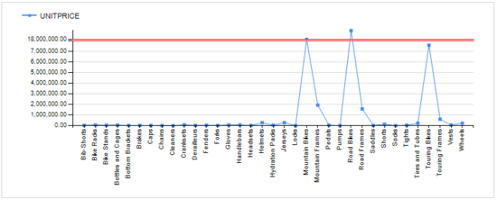
2. BreakLineTpe: Ragged

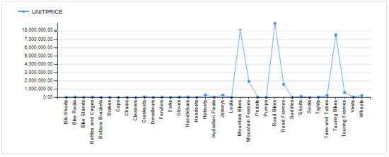
3. BreakLineTpe: Straight
4.BreakLineTpe: None
댓글 없음:
댓글 쓰기